Beyond Pixels: Discover the Emotional Power of Color Grading in Photography
Color grading is more than a technique; it's a transformative art that allows photographers to evoke emotions, create atmospheres, and tell compelling stories through their visuals. As you navigate the world of photography, understanding how different colors influence feelings can elevate your craft to new heights. From the vibrant tones capturing joy to subdued shades conveying melancholy, color grading bridges the gap between mere imagery and profound narrative. In this exploration, we will delve into the emotional impact of color in photography, shedding light on the theory and practical application of color grading with firsthand insights and real-world examples.
The Emotional Palette: Understanding Color Psychology

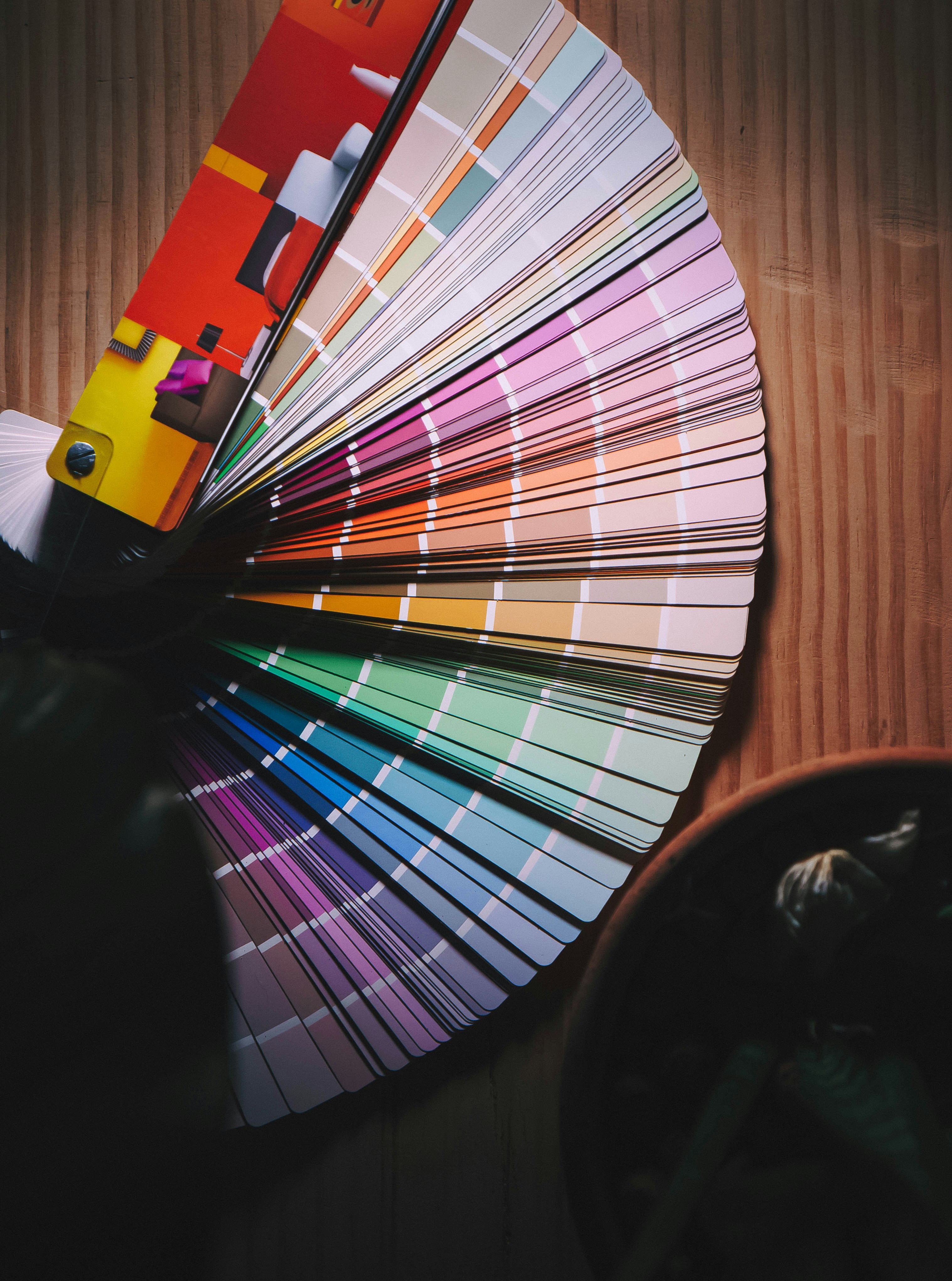
Before diving into practical tips, it’s essential to recognize the psychological underpinnings of color. Each hue carries its own emotional weight—red radiates passion, blue invokes calm, and yellow ignites happiness. This psychological relationship is pivotal for photographers looking to connect with their audience on a deeper level. According to a study published by the University of West England, colors can elicit specific emotional responses, significantly influencing viewers' moods and interpretations. By consciously employing color grading, photographers can capitalize on this influence to enhance their narratives.
For instance, if you photograph a serene beach scene, incorporating cooler blues and soft pastels can evoke feelings of tranquility and relaxation. In contrast, warmer tones might transform a sunlit beach into a vibrant celebration of summer. The strategic use of color can anchor a viewer's emotional experience, guiding their interpretation of a moment frozen in time.
Practical Color Grading Techniques for Improvement

Understanding the emotional weight of color leads us to the practical side: how do we implement color grading effectively? Here are some foundational techniques you can employ in your photography:
Embrace Contrast

Contrast is a crucial component of color grading that can enhance the emotional impact of your images. High contrast between foreground and background can create drama, making subjects pop while further emphasizing their emotional context. During post-processing, use sliders to adjust contrast levels, playing with shadows and highlights to find the perfect emotional balance.
Experiment with Color Balance

Play around with the temperature and tint sliders in editing software. Adjusting the white balance can shift the entire mood of your image. For instance, a colder temperature might suit a gritty urban photo, making it feel more raw and harsh. Conversely, a warmer tone creates a sense of nostalgia or a cozy atmosphere. Experimenting with color balance not only enhances visuals but reinforces your story.
Utilize Color Theory

An essential aspect of color grading is understanding complementary and analogous colors. Complementary colors, located opposite each other on the color wheel, create striking contrasts that can grab attention. Conversely, analogous colors, which are next to each other on the wheel, provide harmony and subtlety. By incorporating these theories into your images, you can shape the emotional undertone.
Color Grading Software

Modern technology has provided us with numerous tools for color grading. Adobe Lightroom and Photoshop are widely used among photographers for their robust capabilities. There are also user-friendly applications such as Capture One and Luminar that allow for seamless color adjustments. Familiarizing yourself with these can dramatically enhance your workflow and the emotional depth of your photographs.
To explore more gear that can amplify your photography, check out our piece on essential accessories.
The Role of Narrative in Color

Photography is, at its core, a narrative medium. Each image should tell a story, and color grading plays a pivotal role in shaping that narrative. It’s essential to define what story you wish to convey. Are you aiming for a dreamlike quality or a stark realism? Understanding the emotion behind your subject will guide your choices in color grading.
For example, think of a portrait where the subject has intense eyes. A monochromatic backdrop with a splash of color in the clothing may draw all attention to those eyes, heightening emotional engagement. In contrast, soft pastels in the background can soften the subject and evoke a sense of calm. The right color choice can strengthen your storytelling capabilities.
Real-World Applications: Case Studies

Exploring practical applications through real-world examples can deepen understanding. Many photographers have mastered the emotional resonance of color in their portfolios:
The Mastery of Annie Leibovitz

Annie Leibovitz, one of the most iconic portrait photographers, employs color grading to infuse personality into her subjects. In her portraits, you often see a mix of warm and cool tones, emphasizing emotional contrast. When capturing a celebrity, the colors can reflect not just the individual’s public persona but also their vulnerability, often leaving viewers with a lingering emotional impression.
Cinematic Influence in Editorial Photography

Visual storytelling in editorial photography often borrows similarities from cinema. Filmmakers understand the psychological impact of color and use grading to manipulate audience responses. Photographers looking to enhance narratives can adopt similar techniques, choosing color palettes that elevate the emotional stakes of their compositions.
In recent light of evolving technology, color grading now also leverages tools like AI in photography, allowing for precise control over emotional tone with just a few clicks. Navigating this new terrain can seem daunting, but embracing technology can enhance your emotional storytelling.
Cultivating a Personal Style

As you explore the depths of color grading, remember to develop your signature style. The emotional resonance of colors can vary between personal perception and cultural context. Emphasize your unique perspective while considering standardized emotional responses to color.
Consider these tips: - Experiment: Try different color grading styles in your photography. From pastel tones to vivid contrasts, experiment until you find a personal signature. - Study: Look at the work of established photographers and directors. Analyze their color choices and emotional impacts. - Journal: Maintain notes on how color grading changes your emotional perception of a photograph. Reflecting on your experiences can enhance understanding.
Gear choice also plays a vital role in refining your style. Minimalist gear allows for flexibility and creativity during shoots, as discussed in this article about mastering gear.
Best Practices in Color Grading
To effectively integrate these insights into your color grading process, consider the following best practices:
-
Know Your Tools: Familiarize yourself with color grading software and their capabilities. Your editing should be driven by a clear understanding of how each tool can shape the emotion in your photos.
-
Create Consistency: As you develop your style, aim for consistency across your work. Whether shooting a series or standalone images, cohesive grading enhances memorability and strengthens your brand.
-
Seek Feedback: Join communities or forums to share your work and seek constructive critique. An outside perspective can unveil aspects of your color grading that you may have overlooked.
-
Stay Engaged: Keep up with emerging trends in photography and design. Color grading isn't static; being aware of shifts in visual culture can influence and enrich your own style.
-
Trust Your Instincts: While adhering to best practices is valuable, your intuition as a photographer should be paramount. If a specific color feels right for narrating your story, trust it.
Final Thoughts: Take Your Photography to New Heights
The power of color grading cannot be overstated. As photographers, we wield the ability to influence emotions and craft narratives with a simple shift in color. By embracing techniques rooted in psychological insights, employing modern tools, and cultivating a unique style, you can unlock the true potential of your artistry. As you explore these avenues, remember the emotional landscape you wish to traverse—each click of the shutter is an opportunity to connect, communicate, and inspire.
Whether through warm, nostalgic hues or bold, vivid contrasts, use color grading to tell your unique stories. Embrace the challenge, experiment fearlessly, and allow your creative voice to shine through the medium of color.
For more tips and insights about enhancing your photographic storytelling, check out our article on unique lighting techniques.